Saturday, October 29, 2011
Thursday, October 27, 2011
REVIEW: Cluster- Adam John Cullen
Cluster: agroupofthingsorpersonsclosetogther. The invite image (below) for Cullen’s show ‘Cluster’ both repulsed and intrigued me, it was the photograph of an open-palmed hand that had a cluster of small, green caterpillars crawling all over it. I hate caterpillars, I don’t know why, my fear may stem from some deeply hidden trauma that’s locked away in my subconscious. The image was a great psychological-masochistic motivator.
Cullen’s work in the exhibition was spread between two rooms, connected by a small window (below) between them, whilst this architectural anomaly is a fixture of Rearview gallery, the multiple rooms lend weight to the underlying concept of grouping, clusters and assemblages, as the separate display spaces themselves come together as a collective.
The first and smaller room of the two spaces is an introduction, a preface comprising of a few photos and some sculptural works on the floor (above), in order to prep the viewer for the second room. Models of black stalagmites rise out of sheets of pine ply (below), they are pillars of accumulated mass, mass that is delivered in tiny particles over hundreds of thousands of years. Stalagmites, like everything, are slow forming clusters, geological clusters of H²O molecules and dust, clusters of atoms. The entire universe comprises of the same building materials that exploded out during the big bang and everything is a new cluster, a new reorganisation, of these minute parts.
The second space feels much less like an incubator or studio space of ideas, and holds the crafted results of his practice: a collection of collages, displayed under uniformed wood panels, under perspex. The works dominate the space, surrounding the viewer, an army of cubic Petri dishes containing the collaged mashed mutants of matter, pictorial hybrids in which landscapes, architecture, botany, and portraiture are fused together, again affirming the similarity between all matter and that all of existences matter emitted from the same source.
Taken from disparate sources and of differing subject matter, the images are not joined in order to create a new recognisable picture or scene, but are joined together by shadows, outlines, colours, creating a loss of gravity or orientation within the image, parts existing together rather than wholes. Even Frankenstein’s monster was comprised of like parts, those of human anatomy, Cullens single-cell patchworks are impossible combinations that could never occur in nature.
Monday, October 24, 2011
Saturday, October 22, 2011
REVIEW: The Band, It makes no difference- Rohan Schwartz
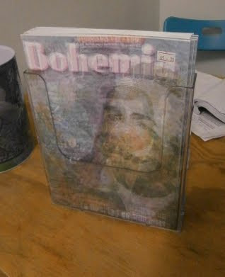
Apathy. Pathos. Everything is the same, it may as well all collapse, or condense, whatever, either one, it doesn’t matter which, and that’s the point: artistic apathy. That’s what is happening in the magazine, ‘Bohemia’ (below), produced by Schwartz: layers of images and text all flattened out to one plane, unreadable, indistinguishable, a huge mess of corrupted visual data, all of it as equally important, or as unimportant, as each other.
Forget art history, or arts theoretical frameworks, the ideology for an artistic practice or exhibition can be formed song titles that express the aforementioned lament (below). Abandon thought and consume popular music in lieu of reading philosophy.
On one table is a copy of The Labyrinth of Solitude with a colour photocopied selection of Australian currency peeking out from the pages (below). If we are to learn anything from Octavio Paz, it’s that ‘Solitude is the profoundest fact of the human condition’ and because it’s so universally familiar, you could probably make a buck out of every single person on the planet by exploiting it.
Pop-musicians (inadvertedly?) use it to convince millions of hormone-riddled teenage girls all over the world that their clichéd sonnets are actually personal messages of love and devotion directed to each and every hopeful, naive, little Miss. Religion takes full advantage of the inescapable truth of solitude and death and sets its sights on a target audience well beyond the small demographic of prepubescent fan-girls. Religion aims at everyone, even members of other religions, no holds barred.
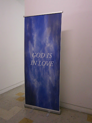
Before you even enter the exhibition you’re faced with a free-standing promotional banner guarding the entrance, however the message it delivers isn’t trying to sell us anything but instead proclaims ‘GOD IS IN LOVE’ (above), but it may as well read ‘SANTA CLAUS IS IN LOVE’. The absurd announcement is printed in virginal, holy white text on a blue skyed photo background, the visual elements amplifying the insanity of speaking for an omnipotent, omniscient, deity whose existence is questionable.
An exhibition review probably shouldn’t be written in suite with the show itself, but (just as Schwartz asks via The Smiths) ‘what difference does it make’?


